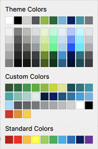
Colours are a vital part of any brand. They indicate how serious or playful the brand is. Whether it represents a youthful image or something more grown up or dignified. The tone of the colour is often important to this end, where a bright orange might be paired with a dark orange for a particular effect. For this reason, as custom colour palette is the next step to helping users stay within the brand rules.
 Primary v secondary colours
We often receive a design that uses a primary and secondary colour palette in the brand guidelines. In most cases, the secondary colours are only used as a highlight or supporting role, and not intended for general use in presentations or reports. The standard Office palette is limited to 10 colours, and this is rarely satisfactory for many brands we work with. Those ten colours do very specific things in Office, so it isn’t always possible to use them in the way you might think. To improve functionality, we can add a custom colour palette to the templates we build that allow those secondary colours to be manually applied from a trusted list.
The main colour theme will be applied automatically, and used throughout the documents as the main colour rules, for headings and charts and shapes, for instance. The custom colours can be used to change things to fit the highlighted brand assets. This year’s column of turnover in a chart, a particular person’s entry in an org diagram, or a quote on a slide.
Please note that the custom colour palette is not supported in the older Office 2011 for Mac or Excel.
There’s a limit of 50 colour values that can be set up, but it’s sufficiently enough for even the most optimistic brand palettes. If you would like to add this to your new brand templates, give us a call.
If you’re interested in taking control of your custom colours, try webfx’s converter for Hex to RGB.
There are several custom modifications we can make to Word or PowerPoint documents and templates that might help you. PowerPoint custom table styles
